


INVITATION & CARDS PORTFOLIO
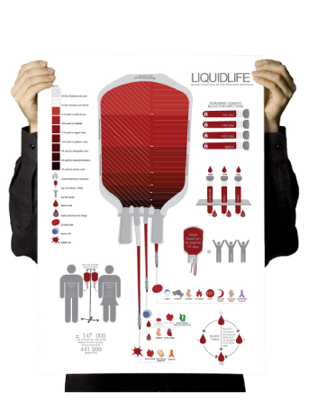
WP BLOOD DONATION INFOGRAPHICS
Infogaphics are a great way to visually display data.
In this poster I used data on the blood donation in the Western Cape. This included how much is donated, how it is split, who gets which part of the blood, how long it lasts, etc.
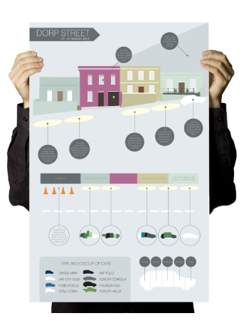
PARKING HABITS IN DORP STREET
This infographic was a project that I did about paking habits in Dorp Street during the week. It shows how you can use sybols and elements to display your data in a way that is fun to read.