


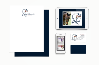
BEDAZZLED BROWBANDS
Be-Dazzled Brow Bands and Show Accessories specialize in creating custom equine products for their clients.
Jamie asked that her new logo have the essence of her horse, Tickle in it. We managed to design a logo that encompassed all her desires, not only to have the essence of her horse, but also the elaborate designs of her custom browbands that she makes.
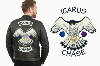
ICARUS CHASE SMC
Icarus Chase is a motorcyle club that required a logo / patch for their club. Members of the club have contributed towards a Peregrine Falcon being rehabilitated at Eagle Encounters at Spier Wine Estate, Cape Town. Diesel, as he has been named by his adoptive parents, will not be released back into the wild due to him having a broken leg which is suspected to have been from the time he was still in the nest as a juvenile.
This is where the design for the logo / patch came from.
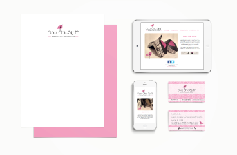
COOL CHIC STUFF
Cool Chic Stuff is a fashion accessory company that is currently selling their products at Cape Arts and Crafts in Canal Walk, hair and beauty salons across SA as well as being processed for Takealot.com and Clicks.
I have designed their Corporate ID, Presentation Templates, Banners for their stand at the Hair and Beauty Expo at CTICC 2014, Packaging layout and die design for their product range as well as website design and development.
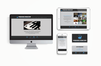
WORDSOURCE PRODUCTIONS
Wordsource Productions is a copywriting, photography and videography company based in Cape town. I have designed their website as well as designed the photography course, flyer and social media material.
All the designs were to be elegant and minimalist to highlight the work be Wordsource Productions. The photos were to be the hero of the designs.
SAVAGE BREWERY
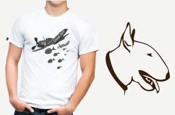
Savage Brew originated as Bad Dog Brewing Co. I helped design the original logo for them (the dog). The design was based on their dog, and thus the symbol came about.
I also designed the t-shirts they used at the 2014 Beer Festival in Cape Town. These t-shirts were a quirky take on transporting hops. These t-shirts were a great hit and came out amazingly. The whole look and feel of the brand is something I really enjoyed working on.

MILNERTON RIDING CLUB
Milnerton Riding Club is a stable yard and competition venue in Cape Town. As they have continual events throughout the year they require striking advertisement for their social media and website.
I also design their monthly newsletter and get in advertisement to cover the cost of the newsletter.
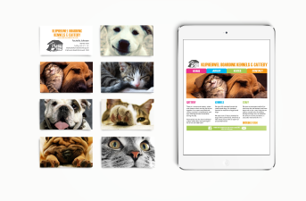
KLIPHEUWEL KENNELS & CATTERY
The website design was to be bright and happy so that the site would be inviting and would make people want to take their animals there. With some lovely photos and the bright colours the result was a very cheerful website that would encourage people to leave their animal babies with Klipheuwel Kennels.

MIRA
MIRA Dynamics is an international cupping therapy company that provides natural solutions. Their colours were to be stand out within the health product competition. Staying elegant but striking.
I have redesigned their Logo, Packaging; plastic pouch, cupping boxes, essential oil boxes and labels for oil bottles.
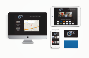
SPK
SPK is an engineering supplier based in Cape Town.
They required a website that was easy to navigate with all their products available for viewing. The design is elegant and well structured with easy userbility. Images of all the products were included in the site.
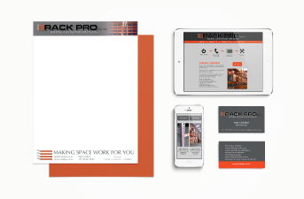
RACKPRO
RackPro is a racking and shelving company based in Cape Town. They require an entire Corporate Identity for the company. The colours chosen were grey and orange as the main pallet.
Their website needed to be easy to navigate with all the required details and specifications available.
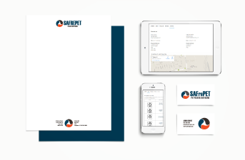
SAFREPET
SAFREPET is a bottle-to-bottle recycling company based in Cape Town. They required a logo that had a recycling look and feel. The colour pallet was to be simple but striking.
The outcome was this logo that resembles the process in a simplified way.
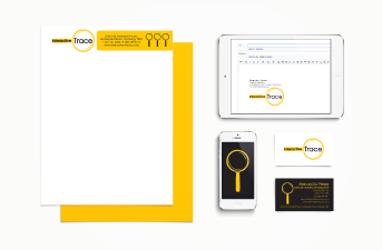
INTERACTIVE TRACE
Interactive Trace is a a tracing company in Cape Town. They required a logo that says what they do from first glance. The magnifying glass seems to work well on all their stationary and stands out visually.
The colour pallet is simple yet striking which is exactly what they asked for.